Introduction
If you own an ecommerce shop, I am certain that you overheard the word "responsive" quite a few times in the last months. If you made the jump and asked the person who was speaking about it, you can skip this introduction and go directly to the first chapter, otherwise the following lines are here to guide you.
The notion of responsiveness is a direct outcome of the lifestyle changes of most of us. Indeed we tend to spend more and more time on mobile phones and tablets and less than before on our desktops (except if you work in a digital agency!). However, the web as we know it has been designed for large screens and solid internet connection; the content was then not adapted to the smartphones. During the second half of the 2000's, and thanks to the development of data plans, websites started to propose a specific version of their content for nomad users. It was the start of the mobile versions. To do-so, publishers of content had to create a whole new website designed for smaller screens. They were usually easily recognizable because of the "m" prefix in the url (for instance m.thedigitalcube.com). These versions had several advantages and, among them, the small consuption of data for mobile phone users.
The last years of the 2000's saw the democratization of the smartphones, in parallel with more attractive data plans - cheaper, faster, more bandwith: Internet was now ready for a change. It all occurred in 2011 with the introduction of CSS3 new feature: media queries. Such functionality became a W3C recommendation in June 2012.
To keep things simple, media queries allow a developer to specify a width from which the page will load new rules. It then creates a smooth transition without having to load the page again. And that's all responsive design is about.
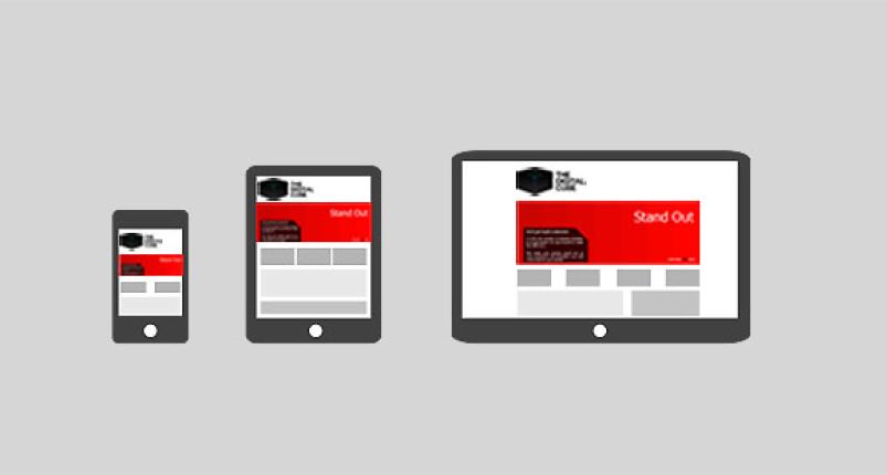
I am certain that you have already been on a website, resized your browser window or changed the inclination of your mobile phone and noticed the site adapted to that new size. You then know what is responsive web design. A wider definition would be the capacity for a website to adapt its content according to the size of the display, and this smoothly and without using javascript.
An outlook on mobile versions
When they were introduced, mobile versions had two big advantages over desktop versions. The first one is obvious, mobile versions proposed a specific content, easy to read on mobile phone, without having to ask the end-user to do any configuration of his/her device. Mobile versions had the advantage to be fully customized with mobile phone features which were really different from the desktop functionalities. The second key innovation was the loading time, way faster than having to load the desktop version since the mobile version is a totally different page.
But mobile versions are not only full of advantages and they present certain drawbacks which could explain why they did not meet a wide success. First of all, if the website is not running under a CMS then any modification on a page will have to be done twice. Moreover, their impact on SEO is uncertain since it would lead to a duplicate content for a page. Although this behavior can be overcome through canonical metatags, Google still recommends to work with responsive versions.
A key issue of mobile versions is that the mobile user has first to connect to the desktop version before being redirected to the mobile equivalent. This is linked to the technology used, mostly based on javascript and user-agent detection. This behavior can be misleading for certain users since they would be confused about which URL to use between the "normal" URL and its mobile equivalent (m.website.com). Last but not least, in terms of cost, mobile versions are expensive since all the design and development has to be done again, and this, taking into account smartphones were not as used as now when mobile versions started appearing.
Why has a new rule been created?
Ironically, that is the democratization of smartphones which led to develop a new functionality. Indeed, a new rule, introduced in 2011, based on Cascading Style Sheets (CSS) made it way easier - and thus cheaper - to have a website which would provide selected and customized content for mobile phone users; it was the start of responsive versions. The first of its advantages is that, since it is based on CSS, the technology is easy to use and lighter than javascript. Also the URL stays the same, no matter what is the device used. This is important since the growth of the sales of tablets would have required the websites to develop a third version (t.website.com?) if the technology of the mobile versions was used again. This also means the same URL no matter the device and a simpler message delivered to the end-user. In terms of SEO, responsive websites are the best solution since the content stays more or less the same and Google interprets it as you making an effort to make your website more accessible.
However this solution is not fully perfect. Even if they are not displayed on the page, some elements will still be loaded, making the page heavier. Additionally, the content is not always well optimized for mobile devices and gives the feeling we are using a low-cost version of the website. The opposite also tends to happen: A website will look like a large mobile version as developers and designers did not put enough creativity into really customizing each website.
Conclusion
Mobile versions have clearly created the basis of a new vision of internet, not only limited to large screen and desktops/laptops. Of course they could have been more successful and widely used, however they made the transition to responsive websites faster and softer. The huge expansion of mobile browsing called for a simpler, cheaper and more flexible rule and responsive websites were here for that. It appears clear that now you should priviledge responsive design over mobile versions. Even if it is a bit less optimized regarding loading time on mobile devices, responsive designs win the battle for their great flexibility, SEO attractivity and simplicity of updates. However, always keep in mind that the content has to be customized to the platform. If the desktop version of your website looks like a large mobile version then you might lose users and/or increase your bounce rate. Providing an accessible content is good, providing an accessible and customized content is best.